The beginning of the Unit X project seems a long time ago. At the start of the unit we were given free licence to do whatever we wanted as a designer. At first this seemed very exciting, not to be restricted to a certain brief and to choose our own way, however this in turn brought its own challenges. It was difficult to fully understand the objectives of the project, what exactly the brief entailed and what as a group and myself as an individual was to be achieved. We were a collective group of people all with differing views, our own personal design ideas and creativity. Ultimately, I now realise that was the objective of the unit, to bring together various individuals from different disciplines to complete a task and display the finished product. On reflection I feel working as a group provided a stimulating environment, allowing a team to collaborate and formulate ideas as a platform to build on. I feel my work has developed and evolved over this process. Much of my primary research was carried out during a recent trip to Palma, Mallorca. I found I was, as most artists are, inspired by the different surroundings around me, both the natural forms and man-made objects. Their structures, appearance, colour and texture inspiring the creative side of me.
Below are a selection of images which I feel influenced my work.


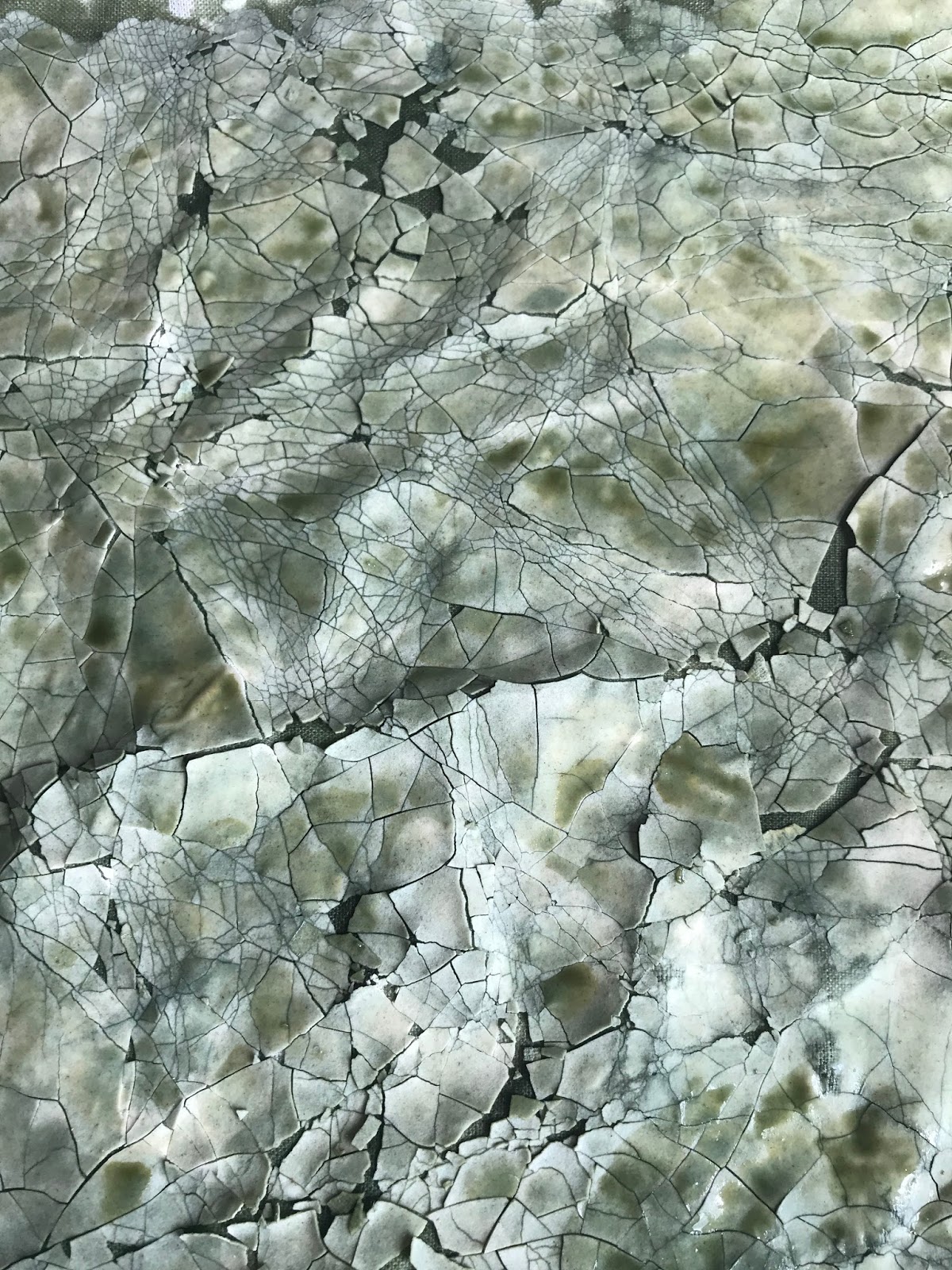
My first sample did not go entirely to plan as I had cracked and squashed the dried flour too much, Therefore when the dye was applied it seeped through the material too much and did not create the crackle effect on the reverse side as expected. The subsequent samples I attempted with dylon dye again this time painting over it very lightly. Further samples did achieve the results on the back of the material which I was hoping for. The process is quite simple however, when I took pictures of the samples on both sides they looked impressive. I also experimented using acrylic, water colour and emulsion paint, the end results were a similar effect, however, the dylon dye was the most effective. I had managed to achieve the ‘crackle glaze’ effect of varying degrees on both sides of the samples. Although the print on the material is 2D, the overall visual appearance is a 3D textured effect. Influenced by Kintsugi ceramics I attempted to add embroidery to a sample, however it wasn't sucessful. A similar effect could be achieved by scanning the samples and using photoshop to add the gold line effect using it as a paint brush. The samples could ultimately be printed on various forms of material, also potentially a sublimation print could be experimented with.


I am satisfied with the materials I chose to use as I believe I ultimately achieved the desired effect. Primary research was an integral part of the process, helping consolidate my ideas and produce effective designs. The exhibition provided an opportunity to showcase our work in a more formal environment further instilling the need for regular communication and the pooling of ideas between group members.
This project has given me a wider understanding of the different disciplines within textiles and has allowed the group, as a whole, to explore creativity with the aim to promote a professional work ethic, whilst meeting targets and improving our own practice. I am still not entirely comfortable speaking in public, however as the unit progressed, I began to grow in confidence during our meetings as a group and felt happy contributing and sharing my ideas which I considered relevant. Every member of the teams input was valued and considered with different disciplines proving beneficial to the overall project and end result.
This project has given me a wider understanding of the different disciplines within textiles and has allowed the group, as a whole, to explore creativity with the aim to promote a professional work ethic, whilst meeting targets and improving our own practice. I am still not entirely comfortable speaking in public, however as the unit progressed, I began to grow in confidence during our meetings as a group and felt happy contributing and sharing my ideas which I considered relevant. Every member of the teams input was valued and considered with different disciplines proving beneficial to the overall project and end result.
On a personal level, an area of improvement for myself would be to gain more confidence in public speaking and presenting ideas. I feel this would benefit me greatly as I progress in my degree and in any future career within the industry. My motivation in this process was to achieve effective designs to further improve my practice, which I feel was a success.
On reflection it is now evident Unit X provides all students of varying disciplines within the context of textiles to promote individual ideas whilst working as a team to complete a given task, ultimately allowing a wider understanding of textiles in its entirety.
Comments
Post a Comment