The aim for this project is to create a body of work suitable for sale and display purposes using different skills from specialist areas. Our project will link the various products through the same use of theme and colour palette. Taking inspiration from a photograph on a leaflet advertising the art gallery we decided to follow this colour palette. The colours contained within the photograph are mainly varying shades of purple, violet and orange. We decided to incorporate shades of green into the colour palette to continue the theme of nature and connecting the inside with the outside. I love the way you can see the reflection of the gardens and trees through the glass windows, allowing the on looker to almost see the gardens inside the buildings. The photograph was obviously taken during late Autumn or Winter as the trees have lost their leaves.
 A photograph of The Whitworth Art Gallery showing the original building of orange bricks with the addition of the glass extension allowing visitors to experience nature and it's forms whilst in the confines of a building. I intend to use diminishing lighting in my designs to produce a spectrum of colour which I have recreated in the colour palettes below.


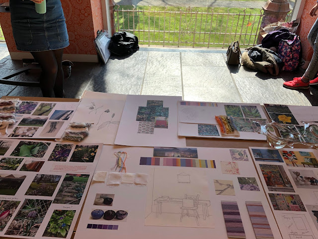
Below are samples of my developing designs...


I have decided to create a digital print wallpaper design encompassing the natural forms which surround the art gallery and which are found inside it's walls. Others in the group intend to make a cushion featuring a printed surface pattern and mixed media, an ornament made from blown glass and a woven wall hanging and table runner.

Above is an example of my initial fine line pen drawings which were inspired by both photographs taken in the gardens and art work on display.


Photographs showing various species of plants and ferns
I think the fine liner pen works really well in the design as it allows me to show the intricate markings of the individual ferns and leaves.


Our mid unit presentation at the gallery allowed us as a group to gather and present our findings and ideas to a member of staff at The Whitworth. The display was met with positive feedback, especially with regards to our colour palette as it was thought to show interaction with the gallery. This positive feedback increased our confidence for our task ahead. Our group had regular meetings to discuss our individual processes and our developments within this area. It was important for us to keep lines of communication open between each other to further understand the concept and context of each others work, ensuring the theme was consistent through all our individual products.
The meaning of the word collaboration is the act of working with one or more people with the purpose to complete a task or produce something. This meeting of different designers within their own personal field should be to the mutual benefit of all involved. Our personal designs should be enhanced by the spirit and aspirations of the group as a whole.
My own creative processes on this project involve mainly simple fine line drawings that I will develop into digital prints. My drawings will be scanned in and made into paint brush motifs. I will experiment with various drawings, to explore different layouts and designs of wallpaper. Within the Whitworth gallery there are samples of William Morris wallpaper coverings which I will use to inspire me. By contextualising my practice, I will look at other wallpaper designers and see how they influence the market, investigating brand leaders such as Laura Ashley, Graham and Brown, Next and Designers Guild.
Below are samples of my developing designs...


During the project it is important to stay focused and consider time management individually and as a team. I intend to explore new technology within this brief in the form of the wide format printing. I feel this will further develop my skills as a wallpaper designer and I look forward to viewing my designs on a larger scale.
Comments
Post a Comment