
Reflection on my work - Architecture


To create a good design, first comes visual research followed by sketches and finally evolving into a final outcome. Drawing is vital as it allows ideas to to be formed on paper for others to see. Without drawings visualising your ideas can be difficult.


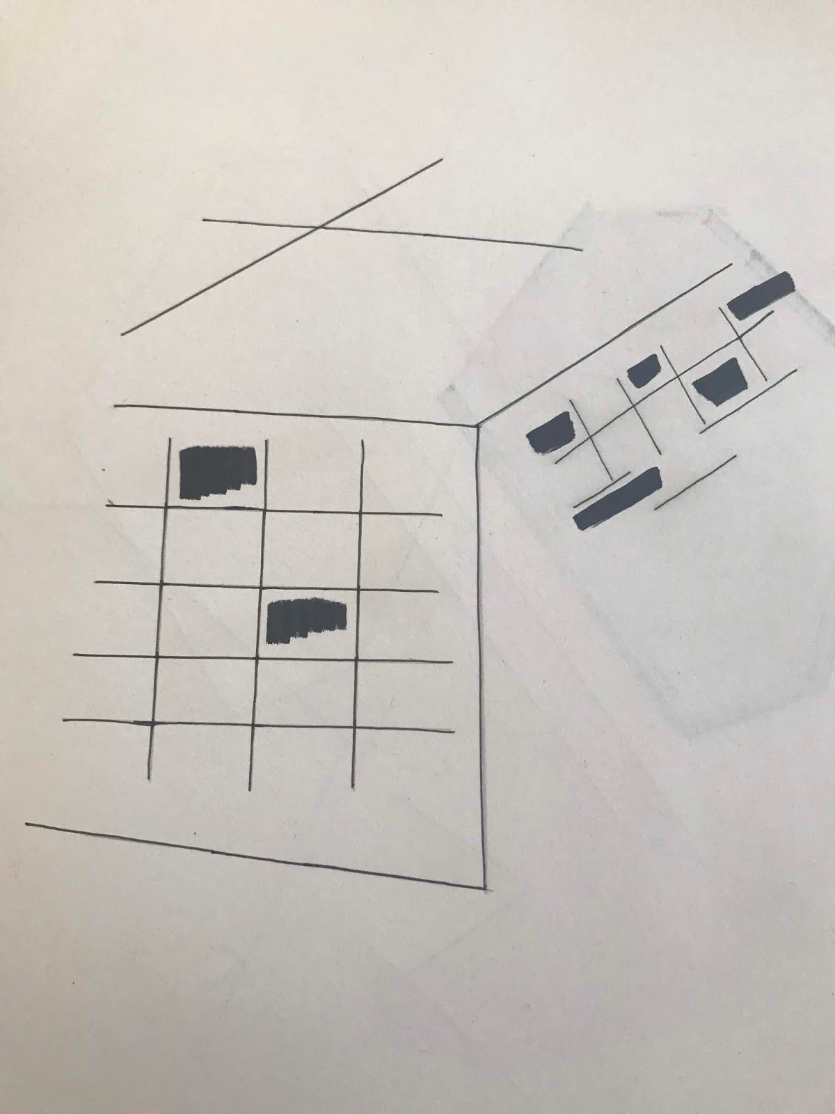
Above are examples of basic mark marking drawings from the beginning of this project. Drawing can be created using various medias, here I have used a simple fine liner and marker pen. The figure on the right shows dark shaded areas which is my interpretation of there shadowing on buildings. I will further develop the shadings and shadows into my drawings. 


For this project I have decided I want my colour scheme to be bright and bold to attract attention and express a young, vibrant energy. Experimenting with block colouring of various shades or textured colours using different medias. 


This design is a digital print formed using various block shapes and colours. It is a limited colour scheme encompassing only various shades of blue and green. I really like the simplicity of the colour scheme which is enhanced by the intricate design. I could really visualise this design on wallpaper on a feature wall. For my further work I intend to introduce more colours taken from my colour scheme. 

Inspiration was taken from the Gherkin building and my research into wallpaper already on the market to produce a sample design featuring bright colours and texture. This sample was produced using a mixture of gouache and acrylic paints in rich colours. I like the textured feel and look of the hand painted design. 

Another example of how my designs evolve from visual research to my own outcomes. 


When creating designs you should also consider the background of your art work. It is this that projects the main subject of the design into our focus. Often the background can be forgotten. A simple white background can help to bring designs to life. 


Comments

Popular posts from this blog

INVESTIGATIONS

The aim for this project is to create a body of work suitable for sale and display purposes using different skills from specialist areas. Our project will link the various products through the same use of theme and colour palette. Taking inspiration from a photograph on a leaflet advertising the art gallery we decided to follow this colour palette. The colours contained within the photograph are mainly varying shades of purple, violet and orange. We decided to incorporate shades of green into the colour palette to continue the theme of nature and connecting the inside with the outside. I love the way you can see the reflection of the gardens and trees through the glass windows, allowing the on looker to almost see the gardens inside the buildings. The photograph was obviously taken during late Autumn or Winter as the trees have lost their leaves. A photograph of The Whitworth Art Gal...

Influences Through Images

My chosen article of particular interest to me Images that have inspired me... This photograph was taken in a small corner shop. The lights are bright and bold in colour captured my interest. I feel the colours could influence my print designs in the future, helping me create colour references, patterns and compositions. The detail of the pattern on each light is similar, but each one is unique in design, displaying different shapes and colours. The photograph has a vintage feel, the lights are similar to 'Tiffany lights', designed in the late 1800's. The lamps were created in stained glass. In the photograph the lights are hung at different lengths but are still all the same size. In a coffee shop in Southwark, Bermondsey, a quirky space away from the hustle and bustle of the city. A range of quite basic, random motif drawings scattered around the walls caught my eye. The images ar...

Locating Evaluation

This unit contained two separate parts, the first part was the I-DOTT live brief. This I found intriguing and exciting as I have never been set the task of a live brief before. To begin with my initial action was to as usual research into the theme of geometric design. I explored the many different ways of presenting a geometric pattern, it’s origins and modern form. I enjoyed researching the work of Escher and his diminishing tessellations. This art form is shapes closely fitted together in a repeated pattern without gaps or overlapping. Looking at my collection of designs I can see the origins of geometric design within my work. A good example of this is the sample below. This design is created using a  motif from my drawings then formed into a digital print. Inspiration was  definitely taken from a photograph in my visual research area.  Echer's geometric art work was made up of more intricate designs. I found his designs of bright b...