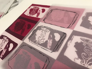
At the beginning of this project I was asked to produce approximately a hundred object drawings. Although I find drawing enjoyable I have found some of the more complex work rather challenging and, on occasions, have lacked confidence when trying to create a piece to a high technical standard. The assignment has highlighted that drawings can be produced not only in pencil but from different medias such as paints, charcoal and ink, incorporating various textures and styles. The sheer quantity of drawings required helped to greatly improve my sketching technique.
I chose fabrics suitable for a range of interior products such as cushions, bedding, lamp shades and blinds, including heavy weight cotton and polyester. The pigment colours and effects produced varied on different fabrics. I have used many digital prints within my collection, as I felt they integrated well and complimented each other.
 I have found using my sketch book very beneficial when planning prints from conception. Also by creating a series of digital prints I was able to visualise my ideas better and, as a result, used my time more effectively in the print room.
My understanding of Photoshop has greatly improved through increased use and the many features of the software has taught me how to improve the end result through visualisation, repeat pattern and colour adjustments to images. I believe I should now strive to further explore my range of prints. On reflection I could perhaps of taken more risk with my samples.
During my research, I was inspired and influenced by the simplistic images of artist and designer Andy Warhol. Comparing my work with my peers, it is evident I have taken a different direction, and I am happy with the style. It is through collaboration and comparison that we all evolve and improve as artists.
If I was to start the project again would I change anything? I would perhaps consider using mark making images rather than solid images. Overall I have found this project enjoyable but challenging at times, however on reflection I am happy with the end product, simple designs, yet effective results.
If I was to start the project again would I change anything? I would perhaps consider using mark making images rather than solid images. Overall I have found this project enjoyable but challenging at times, however on reflection I am happy with the end product, simple designs, yet effective results.


Comments
Post a Comment