
Influences Through Images


My chosen article of particular interest to me


Images that have inspired me...


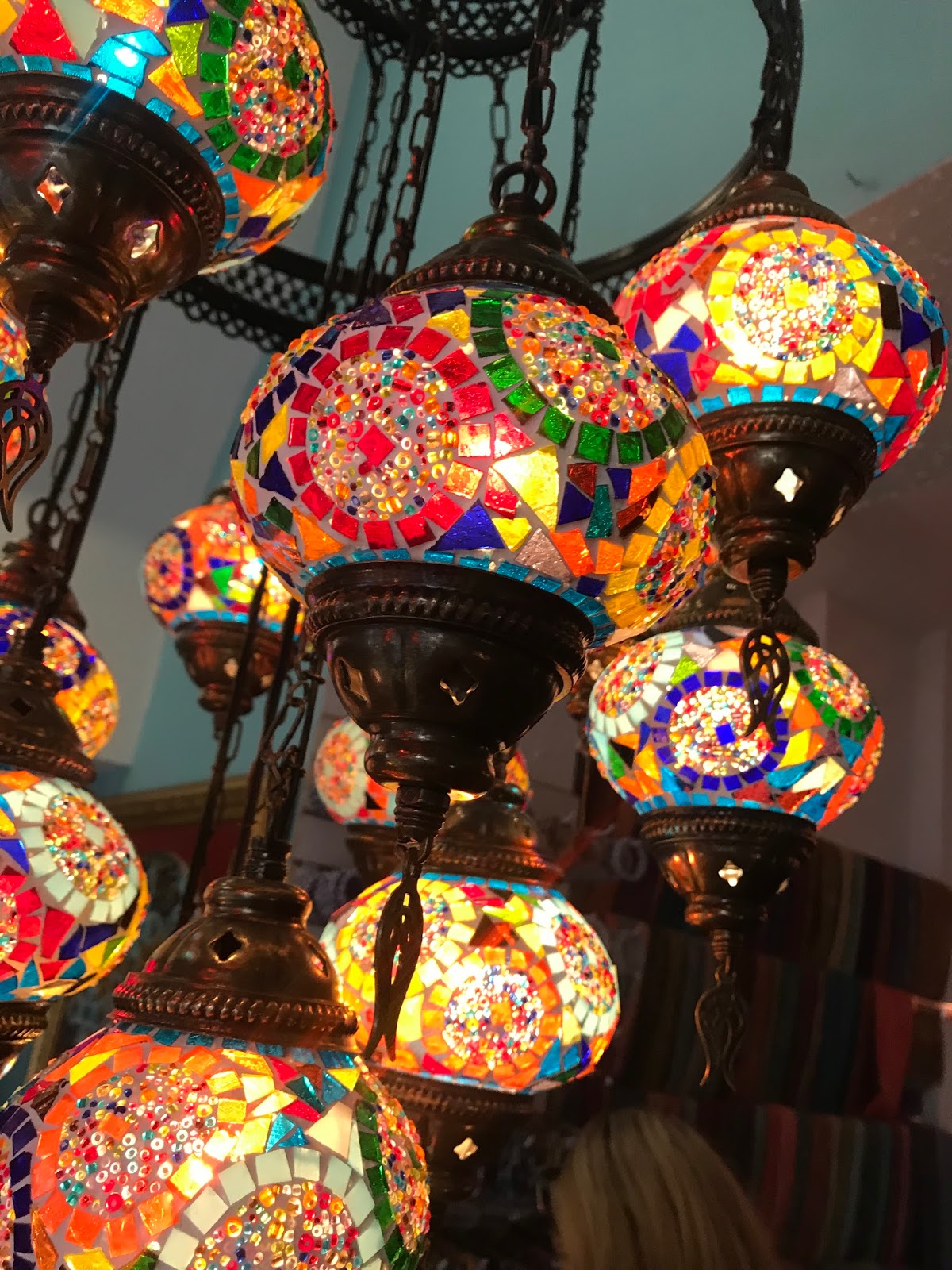
This photograph was taken in a small corner shop. The lights are bright and bold in colour captured my interest. I feel the colours could influence my print designs in the future, helping me create colour references, patterns and compositions.

The detail of the pattern on each light is similar, but each one is unique in design, displaying different shapes and colours. The photograph has a vintage feel, the lights are similar to 'Tiffany lights', designed in the late 1800's. The lamps were created in stained glass. In the photograph the lights are hung at different lengths but are still all the same size.


In a coffee shop in Southwark, Bermondsey, a quirky space away from the hustle and bustle of the city. A range of quite basic, random motif drawings scattered around the walls caught my eye. The images are almost childlike and basic in design, easy to create and similar in design to some of my object images. I particularly like the extra media added in the form of the neon light with the simple phrase 'dare to dream'. My current project could be inspired by this type of drawing and media.


Taken in The Natural History Museum in London, I think this image will be inspirational in my sampling project of objects, which I am currently working on. In the photograph there are a range of different butterflies, displaying various colours and sizes. Each individual butterfly has it's own unique markings and pattern.


The final image, again from the Natural History Museum, features drawings of different jellyfish. I really liked the image and was drawn to it. I love the dramatic monochrome design. The jellyfish all have a 'mushroom like' shape. They look like they are suspended in space. The image is very simple but dramatic and I could see this as a simple print in black and white or with added colour.

Comments

Popular posts from this blog

Nature

Continuing with my research and the impact that colour has on our world, I decided to put down my thoughts once again on mind maps. I find collating and presenting my ideas in this way gives a clear indication of where my ideas and thought processes are heading. My first mind map introduces the  Psychology of colour, how this is seen and what each colour symbolises. This is referring back to a previously mentioned Chinese five colour system. Colour to us all can be perceived in varying ways. Light as we have already found can dramatically change the aspects of different colours. Yellow tones are thought to create warmth and energy, white is thought of as pure and innocent, red promotes love, excitement but also anger. Interestingly green is thought to promote a calming and relaxing feel. This is in line with the Chinese colour system where the colour green was thought to promote harmony. Colours have also been known to affect peoples moods and how they view their surroundings. Gree...

INVESTIGATIONS

The aim for this project is to create a body of work suitable for sale and display purposes using different skills from specialist areas. Our project will link the various products through the same use of theme and colour palette. Taking inspiration from a photograph on a leaflet advertising the art gallery we decided to follow this colour palette. The colours contained within the photograph are mainly varying shades of purple, violet and orange. We decided to incorporate shades of green into the colour palette to continue the theme of nature and connecting the inside with the outside. I love the way you can see the reflection of the gardens and trees through the glass windows, allowing the on looker to almost see the gardens inside the buildings. The photograph was obviously taken during late Autumn or Winter as the trees have lost their leaves. A photograph of The Whitworth Art Gal...

Royal Armouries Museum Leeds

The second part of this unit required us to visit the Royal Armouires Museum in Leeds. Housing arms and armour from all over the globe and and exhibiting warfare from many different times. There are many different exhibitions on display including the Oriental Gallery and The Swords of Middle Earth.  I feel a lot of the items on display were more applicable to students specialising in weave or   knit, however, I did take inspiration from markings and thin linings. Rather than looking at the image as a whole, I zoomed into certain sections to highlight individual areas of interest. This enabled me to produce simple drawings that could be used as my motifs to form overall prints.  Although I am not particularly interested in warfare as a whole, I do feel the trip was beneficial for me to visualise and take inspiration from objects and translate this into a design form.  Scanned in pages of my sketchb...